Learn Easy-Online Learning Platform Website
Learn Easy is an online education platform designed to provide students and professionals with access to affordable, high-quality courses.
Services:
- UX/UI Designer & Visual Strategist
Client:
Learn Easy (Concept)
Platform:
Website
Tools:
Figma, Photoshop, Illustrator, HTML/CSS
Project Background
Learn Easy is an online education platform designed to provide students and professionals with access to affordable, high-quality courses. The platform bridges the gap between learners and instructors by offering engaging, responsive, and user-friendly interfaces for course discovery, enrollment, and learning.
My role was to design a clean and accessible user interface that supports user conversion, course exploration, and instructor promotion while maintaining a professional and welcoming brand identity.
Objectives
Design a compelling landing page that communicates trust, clarity, and value
Highlight top categories and courses with clean visual hierarchy
Streamline the process of course browsing, filtering, and enrollment
Design a dedicated CTA section for instructors to join the platform
Create a responsive UI for both desktop and mobile views
Research & Strategy
Key Sections Designed:
Prioritize information clarity
Build trust through visuals and testimonials
Improve user acquisition through strong CTAs
Provide a visual distinction between student and instructor journeys
Design Approach
Key Sections Designed
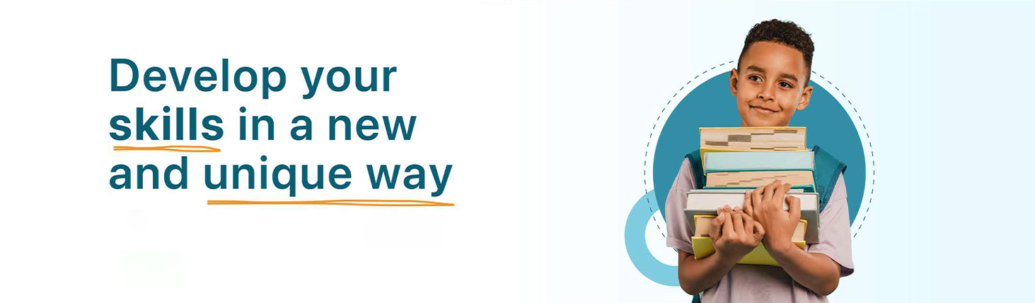
Hero Section: Clean messaging with CTA buttons and visual character hook
Why Us Section: Four visually distinct selling points (Tutor, Curriculum, Certificate, Price)
Categories & Featured Courses: Grid layout with hover interaction and price clarity
Instructor CTA: Highlighted block for teachers with benefit badges
Testimonials: Rotating carousel showcasing student satisfaction
Footer & Contact: Accessible contact form, newsletter subscription, and app store promotion
Visual Style:
Color Palette: Modern blue-teal blend paired with energetic orange for call-to-actions
Typography: Sans-serif fonts for readability and warmth
Iconography: Simple, scalable icons that reflect education and professionalism
Imagery: Use of friendly faces, real-life classroom and mobile visuals
⚠️ Can’t view the full case study?
This presentation is protected to maintain the originality of the work. If you're unable to load or preview the case study, feel free to reach out — I’d be happy to share it directly with you.
📩 Email: connect@sivauruturi.com
©Design by Siva Uruturi
Share feedback on LearnEasy
If this case study stood out to you, I’d love to hear what worked well and what could be even better.