Hashnet
HashNet is a modern tech solutions company seeking to establish a strong, future-ready identity in the digital space. With a focus on security, speed, and innovation, the client needed a visual brand that could align with their technological values while remaining versatile and scalable across digital and print applications.
Services:
- Logo Design & Brand Identity
Client:
Hashnet
Project Type:
Logo & Branding Identity
Duration:
1 Week (June 2024)
Project Background
HashNet is a modern tech solutions company seeking to establish a strong, future-ready identity in the digital space. With a focus on security, speed, and innovation, the client needed a visual brand that could align with their technological values while remaining versatile and scalable across digital and print applications.
My Role
As the Brand Identity Designer, I was responsible for:
Designing the primary logo and icon system
Defining the visual language (color palette, typography)
Creating a brand presentation suitable for pitch decks and marketing assets
The Challenge
HashNet wanted a logo that symbolized both connectivity and technology, but also appeared minimal and scalable for use in UI elements, business cards, and websites. The real challenge was to maintain a balance between technical precision and visual simplicity.
Research & Insights
I began by analyzing competitors in the Web3, cybersecurity, and SaaS domains. The visual trend leaned toward overly complex or cliché digital iconography. My goal was to cut through the noise with something clean, geometric, and timeless.
Design Strategy
Symbolism: The logo subtly integrates a grid-based pattern resembling a network or hash structure.
Typography: A custom, slightly monospaced font was chosen to represent code and structure.
Colors: A strong yet neutral palette of blacks and gradients to evoke security, seriousness, and reliability.
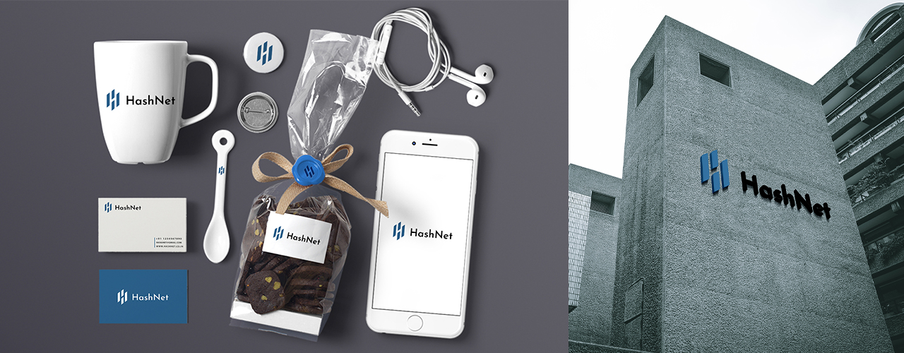
Visual System
Primary Logo: Bold and modular
Icon Variant: Perfect for app favicons, social profiles
Grid Application: The logo was built with a pixel-perfect grid structure
Mockups: Displayed on dark and light backgrounds, business cards, and branding slides
⚠️ Can’t view the full case study?
This presentation is protected to maintain the originality of the work. If you're unable to load or preview the case study, feel free to reach out — I’d be happy to share it directly with you.
📩 Email: connect@sivauruturi.com
©Design by Siva Uruturi
Share feedback on Hashnet
If this case study stood out to you, I’d love to hear what worked well and what could be even better.